Surprisingly enough, we were able to see some actual golf apparel at the 2013 Open Championship, not just round after round of golfers in rain gear. Seems like every week of the PGA tour, rain delays abound. The one week we expect daily rain showers, and they are absent. Excellent. Good thing no one skipped the whole “what to wear” pre-planning, huh? Though, as always, a few brands should have spent a little more time at the white board before sending their guys out to Muirfield. Some absolutely nailed their presentation, and some had to explain their strategy before I decided to buy into their showing.
Lee Westwood- Dunlop
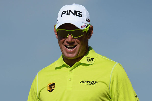
Lee Westwood wore one too many neon Dunlop polos this week if you ask me. Don’t get me wrong, I am probably one of the biggest supporters of neon you will find, but it just doesn’t suit him on the golf course, in my opinion. Would also like to see him go easy on the white pants. Once a weekend should do, Lee. However, you gotta love his winning smile, after a gutting loss on Sunday.
Bubba Watson- Oakley
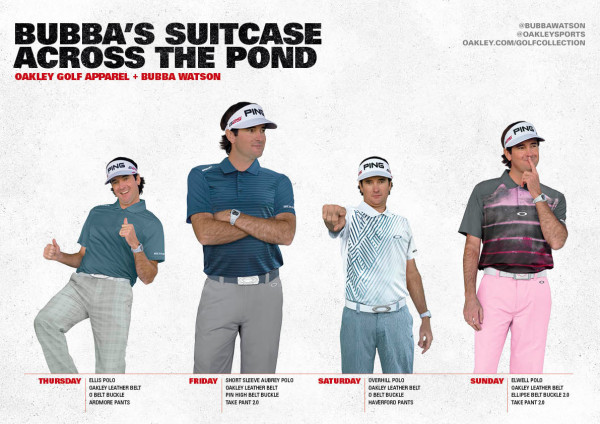
I am all about gambling when it comes to golf apparel style, but I think Oakley needs to step away from the craps table for a while. Bubba’s Thursday and Friday looks are just fine, but the pattern in Saturday’s polo was not flattering. Sunday’s look was simply ridiculous. The pink pants were much more muted than they appear in the image above, and they were paired with a disturbing polo that had a bright magenta splatter resembling blood across the midsection. I wanted so badly to like it, because I am a huge advocate of unique design, but something is just not clicking, Oakley.
Graeme McDowell- Kartel
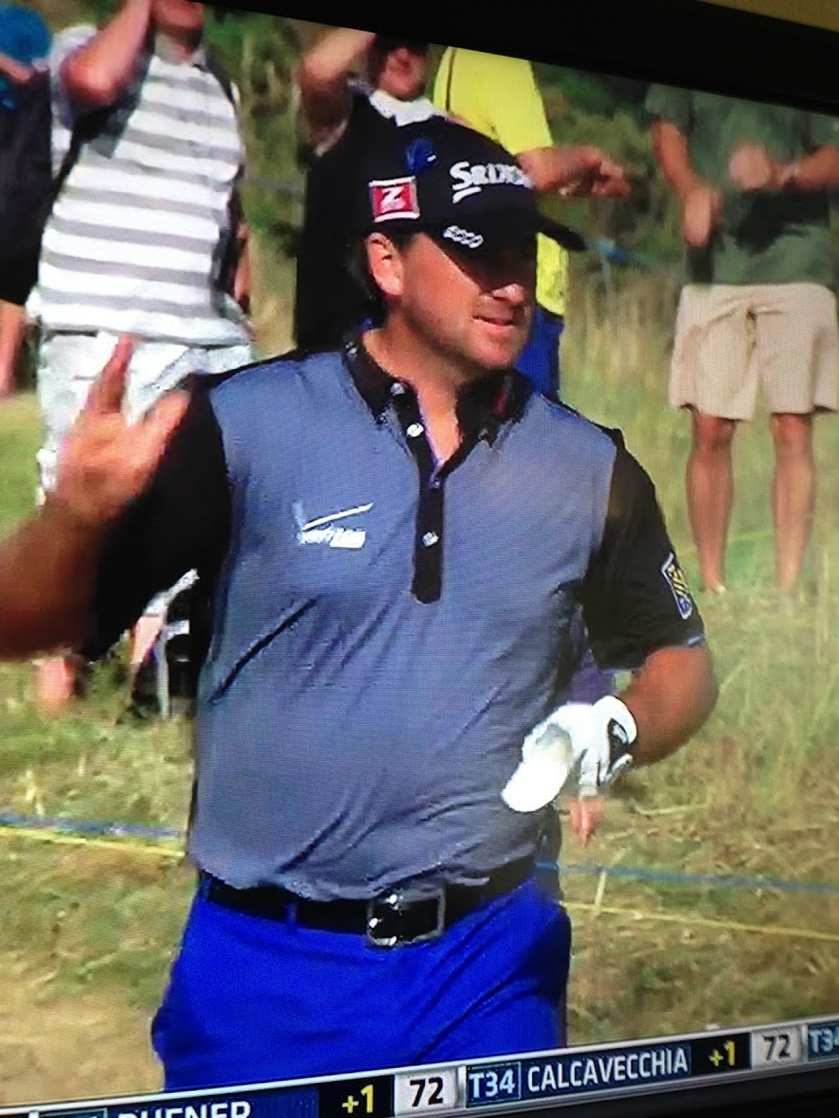

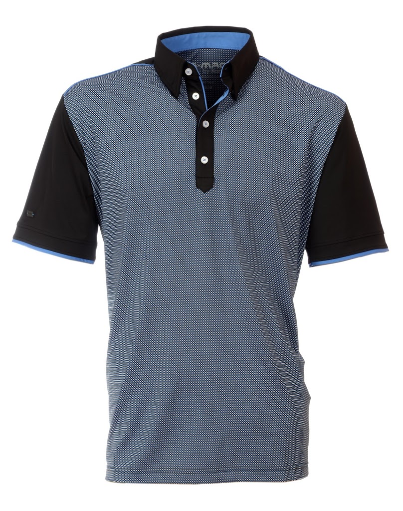
I am usually on board with the looks Kartel partners with McDowell to create for his game. So much so, that I actually went to Kartel with questions in hand, after what initially seemed like a Thursday-round fashion disaster for McDowell. Normally, I would just call it like I saw it, but I knew there had to be some sort of explanation. G-Mac always looks fabulous on the course. See the screen shot above of Thursday’s TV Coverage. As I told Kartel, it looked like he is wearing bright royal blue pants with a slate gray polo. I was getting messages sent my way on how G-Mac looked awful and didn’t match. I agreed. However, I am glad I reached out for an explanation. “We matched the blue pants with the McRetro polo because of the subtle blue on the sleeve tipping and back neck collar of the shirt. Unfortunately the TV coverage didn’t pick this up very well,” said a Kartel representative. Upon further observation, the look was actually quite stunning. Nice work as always, Kartel.
Shingo Katayama- Dance With Dragon

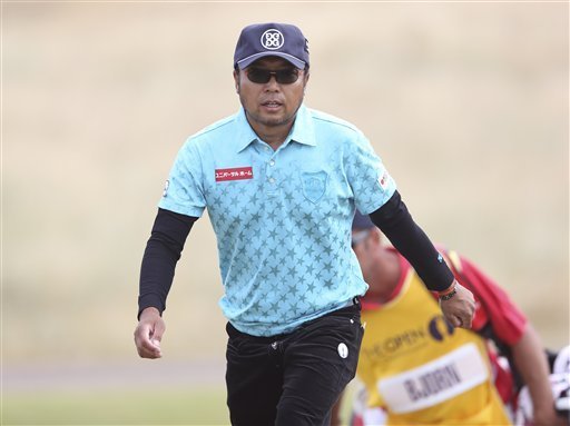
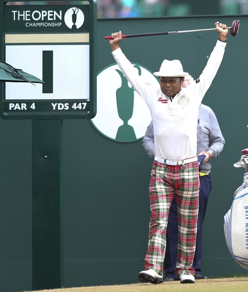
If I have told you once, I have told you a hundred times, the best thing an apparel sponsorship can do for a golfer is help him stand out and create a bigger name for himself. Boom. I would say the Japanese partnership of Dance With Dragon and Shingo Katayama has done just that. Love it or hate it, Katayama’s dynamic, bold style made a huge statement this week, as it has for years. Keep dancing, Shingo.
Billy Horschel- RLX Ralph Lauren
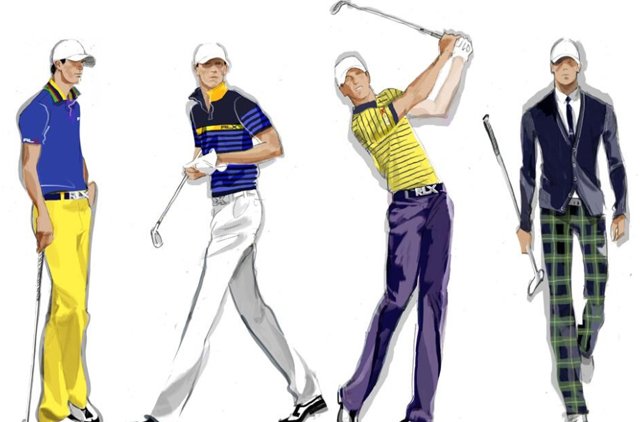
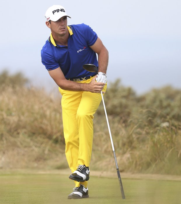
Ralph Lauren knows what they are doing with Billy Horschel. He is a clean-cut, good looking, all-American type guy, so he fits the Ralph Lauren brand like a glove. Good choice, Ralph. RLX has also planned key, buzz-worthy looks for Horschel’s major appearances that have left the world of golf and all it’s fans anticipating what is next in the line-up. Horschel recently wore the famous octopus pants at the US Open. This week at Muirfield, anyone who had seen the pre-released apparel card for Horschel was rooting for him to make the cut, mostly so they could see his Sunday button-down cardigan and plaid pants. Has ever apparel that WASN’T worn, gotten more attention than what was worn?! Though we were all disappointed when Horschel didn’t make the cut, he still looked incredible during the first two rounds of the Open Championship.
Ian Poulter- IJP Design
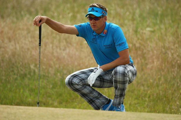
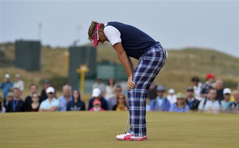
If I am ever going to be accepting of too much tartan plaid, it is during the Open Championship, especially when it is hosted in Scotland. So, credit where credit is due for Ian Poulter’s IJP Design this week. First of all, he incorporated electric blue, and anyone who has read an ounce of what I have written this season knows I am a massive advocate of electric blue. Poulter paired it perfectly with gray and white tartans. I received several comments on Poulter’s hot pink visor and Puma shoes during Sunday’s round. I admit, they did take away from the excellent navy sweater vest and navy tartans with hot pink accents, however, overall I thought IJP Design did a fine job of mixing bold with classic golf style. Great golf performance too, Ian.